

Too nice? no such thing.
Scofflaw is a popular craft brewery in the Southeast that is headquartered in Atlanta. Known for their hoppy IPA’s, they’ve recently begun to explore various other realms of the beverage industry including adaptogen drinks and bourbon. For their most recent project, “Nice Lager”, they brought me in to the fold to create a unique brand identity that would stand out on shelves among competing lagers. After studying what competitors were doing with a repeated trope of vintage Americana-esque cans, I pushed the team to explore the idea of a throwback design that had a punchier aesthetic. After presenting a concept board showcasing the vibrant colors of retro ski culture and the evergreen “70’s stripe” that has been utilized by many brands before, they were quickly onboard. From this topsy-turvy stripe, I crafted a custom NICE wordmark, supporting color palette, and worked with Scofflaw’s marketing director, Christina Albetta, to craft equally quippy copywriting. The resulting packaging and additional merch items are eye-catching, playful, and easy to consume…just like the beer!


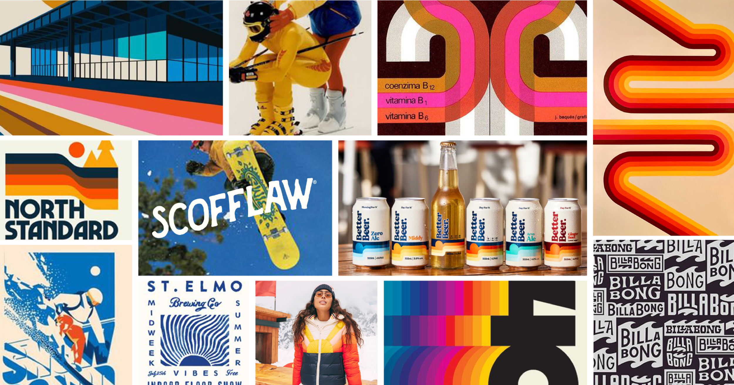
concept board chosen by the Scofflaw team
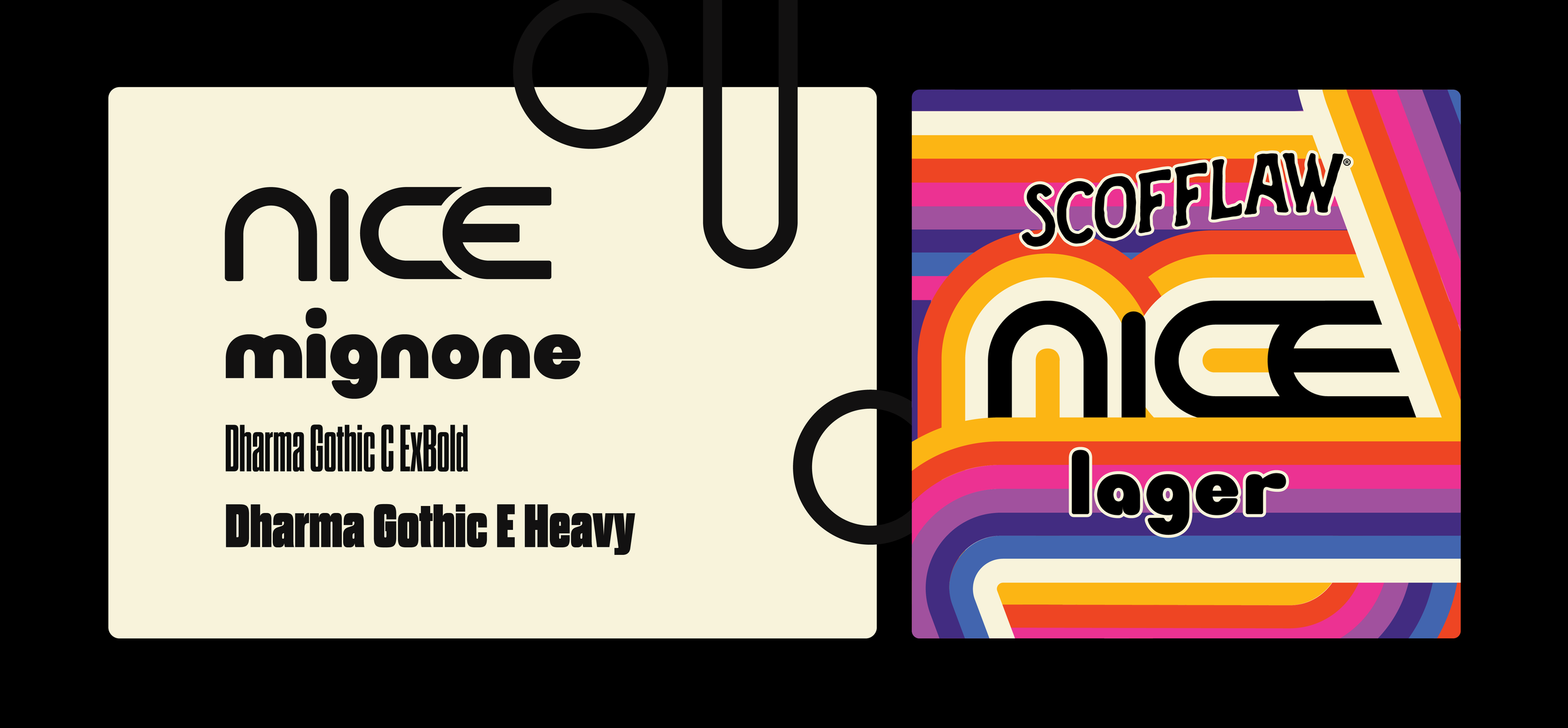
typography, styling, and secondary pattern

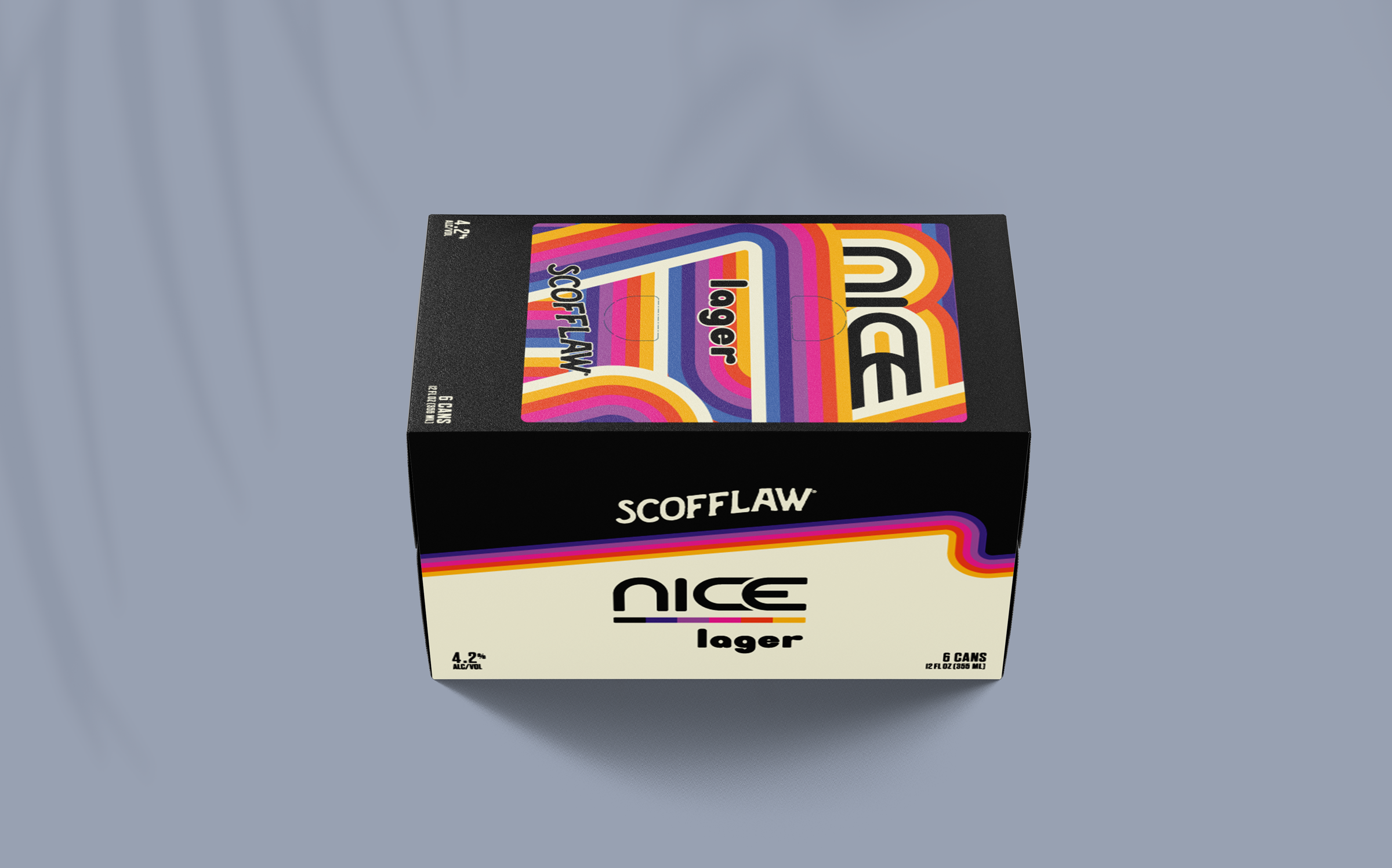
6pack and 12pack flatlays

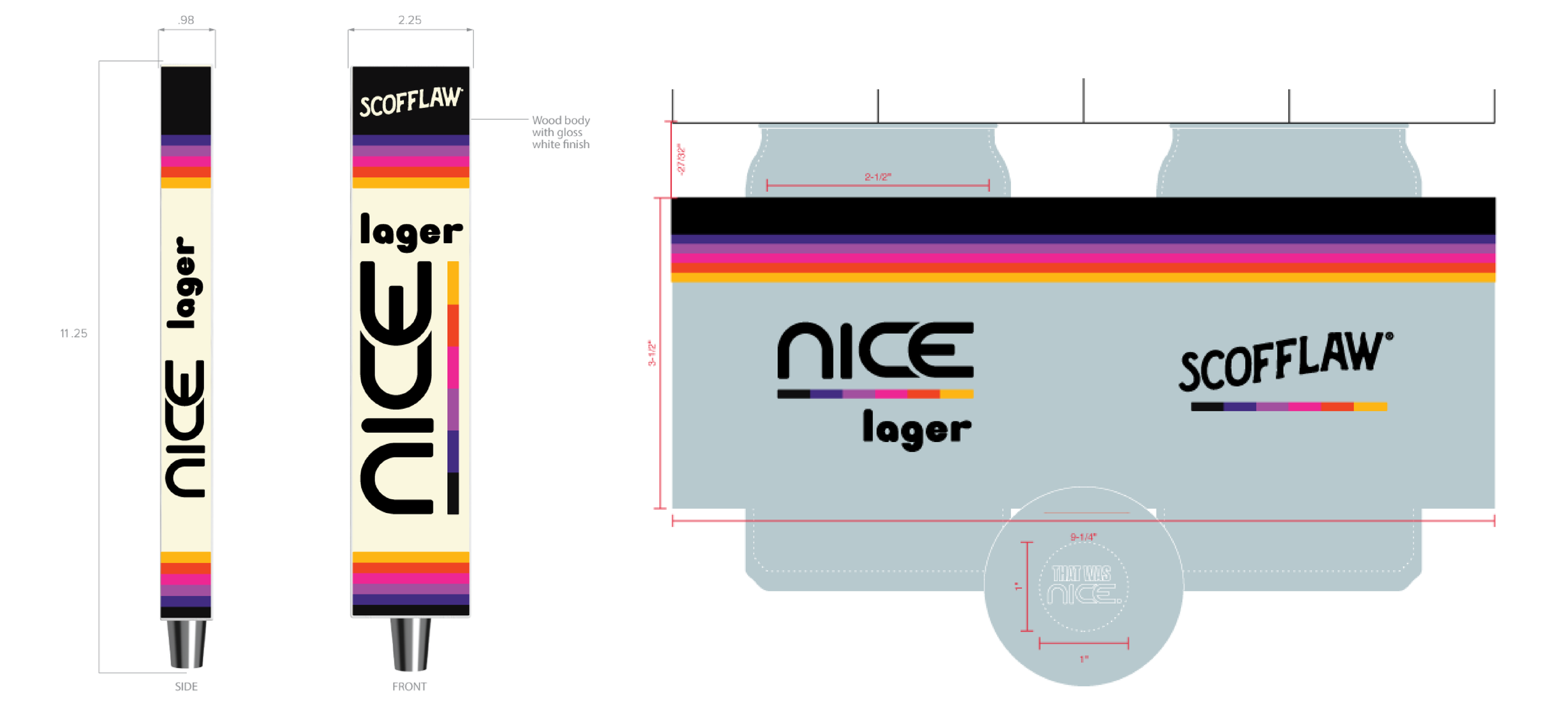
draft handle and glass steins for use in the taprooms


coasters
