creativity and connection.
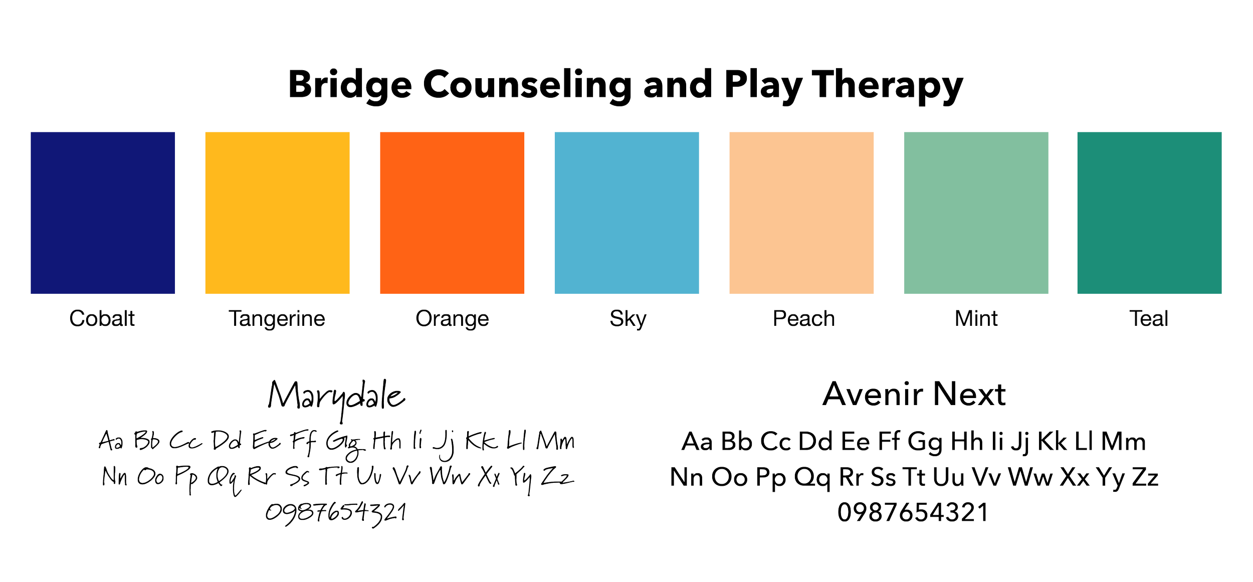
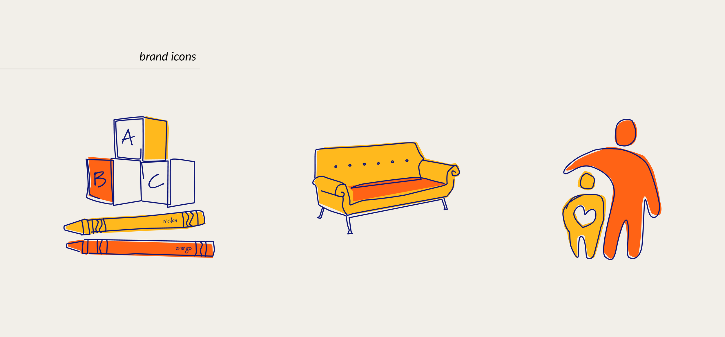
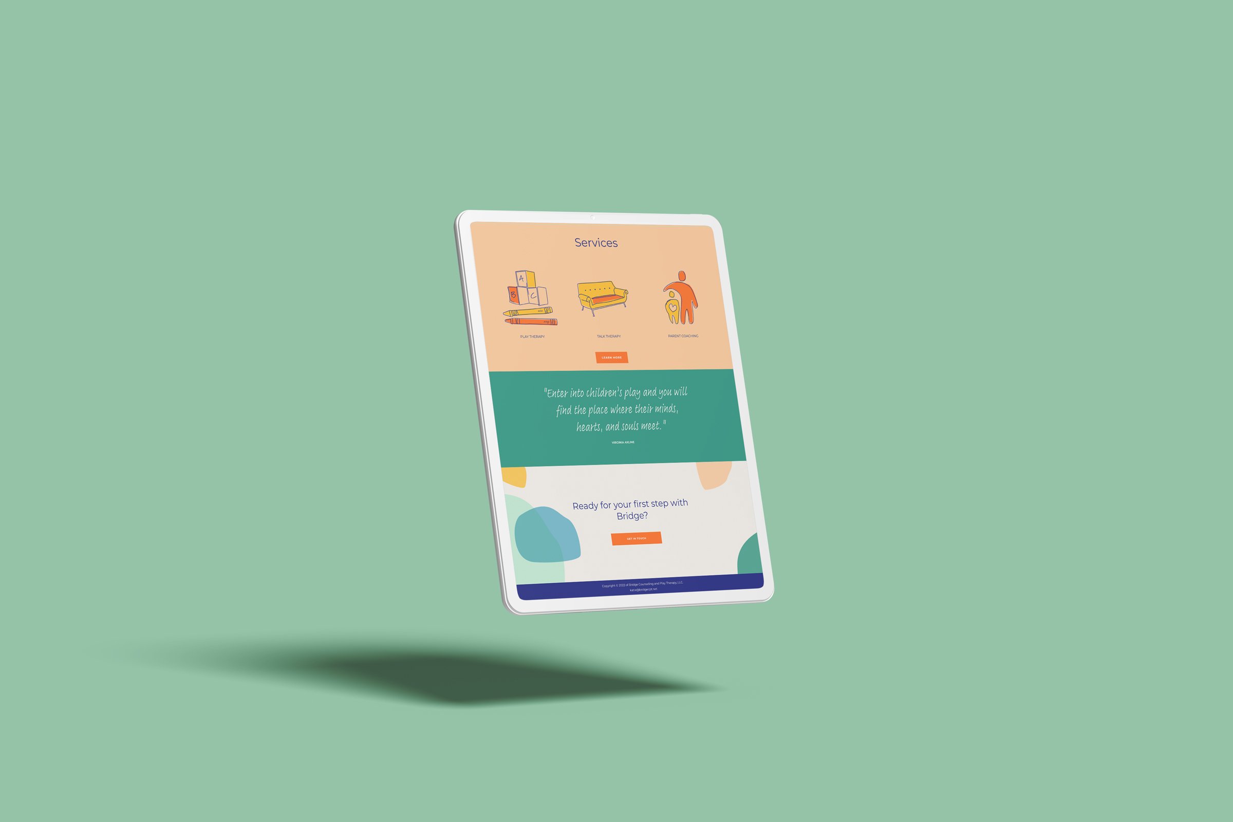
Katie Y. approached me to craft her new brand identity for her therapy practice. She wanted something that felt modern and professional but still conveyed her sense of creativity and wonder, especially with her clients being young children and their parents. We started off creating a logo that was a sketchbook interpretation of a bridge. We added in organic shapes, a punchy color palette, and custom brand icons to tie everything together before creating a sleek and sophisticated website to intake her new clients with. The end result is upbeat, approachable, and can evolve with Bridge as its business grows.


